This tip is aimed for the Beginner - Advanced users. This is not really a step by step tutorial but rather a conceptual one. I believe that explaining the underlying methods and concepts will help you develop your own style in the process.
This post is to demonstrate the capabilities with-in Archicad as base canvas and Photoshop as your mixing palette.
From the get-go, I must admit that Archicad is not really a rendering tool, this is not particularly its strength but it does cope up with its BIM capabilites and parametric options. However, I feel that only a few has taken advantage of its Sketch Renderer.
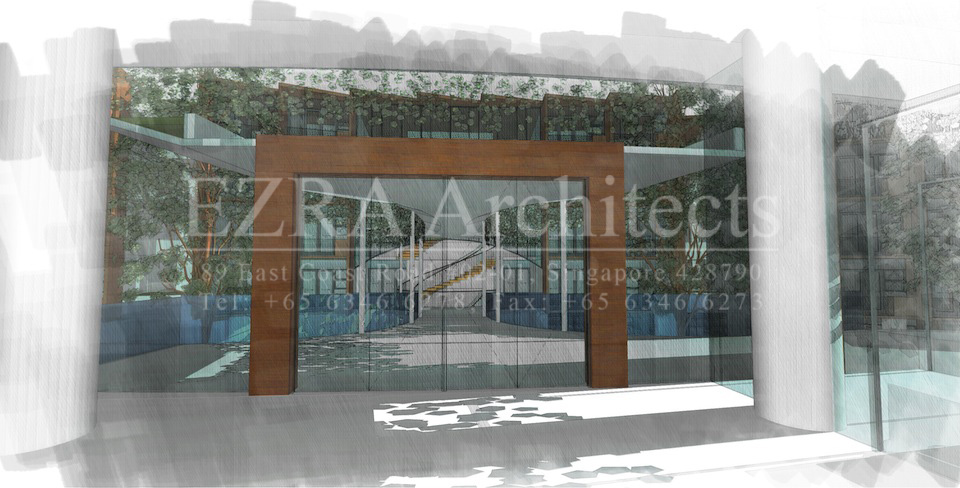
Below is a sample image that was done exclusively with Archicad's built-in render, mixing the output from these various methods of sketch, lightworks and internal rendering engine. The only disadvantage that I see through this process is that it requires you to render a lot of images to establish your base canvas. However, when you get out, you have the control and freedom on how you want to execute it.

This is the basic workflow when i made this image:


*** Things to note:
1. Multiply Layer mode will allow all your blacks to come out and have the whites be transparent or removed.
2. Softlight Layer mode allows the color tones of the underlying layer to be vivid. This also acts as a "color filler" for the image.
Lastly, brushes in Photoshop can easily be googled. There are tons of variation from a marker output into achieving a watercolor feel to your artwork. Some of them will come at a price, but most of them are free!!! So just google it.
Experiment with the type of lines that you get from the Sketch Render. Do not limit yourself in only using Koh-I-Noor :P. Play with the the line overlaps as well if you desire.
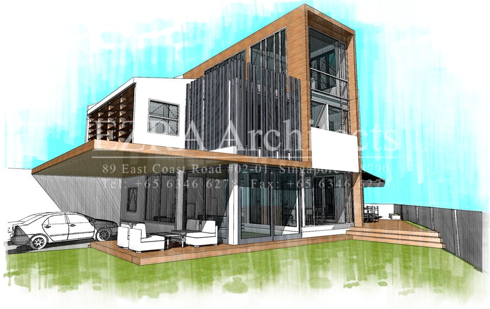
Here is another example on what i did using the same process:

I hope this helps shed some light in your design process. Remember, you don't need Sketchup all the time.
Cheers!
 This is the basic workflow when i made this image:

 *** Things to note:
1. Multiply Layer mode will allow all your blacks to come out and have the whites be transparent or removed.
2. Softlight Layer mode allows the color tones of the underlying layer to be vivid. This also acts as a "color filler" for the image.
Lastly, brushes in Photoshop can easily be googled. There are tons of variation from a marker output into achieving a watercolor feel to your artwork. Some of them will come at a price, but most of them are free!!! So just google it.
Experiment with the type of lines that you get from the Sketch Render. Do not limit yourself in only using Koh-I-Noor :P. Play with the the line overlaps as well if you desire.
Here is another example on what i did using the same process:
 I hope this helps shed some light in your design process. Remember, you don't need Sketchup all the time.
Cheers!